The Brief
Harry Specters is a premium chocolates company who provide handmade chocolates. Alongside that they are also a social enterprise who hire people with autism. They wanted their identity and packaging to reflect the fact that they are a luxury brand. There was also a worry that focusing too much on their social mission would distract potential customers from the chocolates, which have won multiple awards.
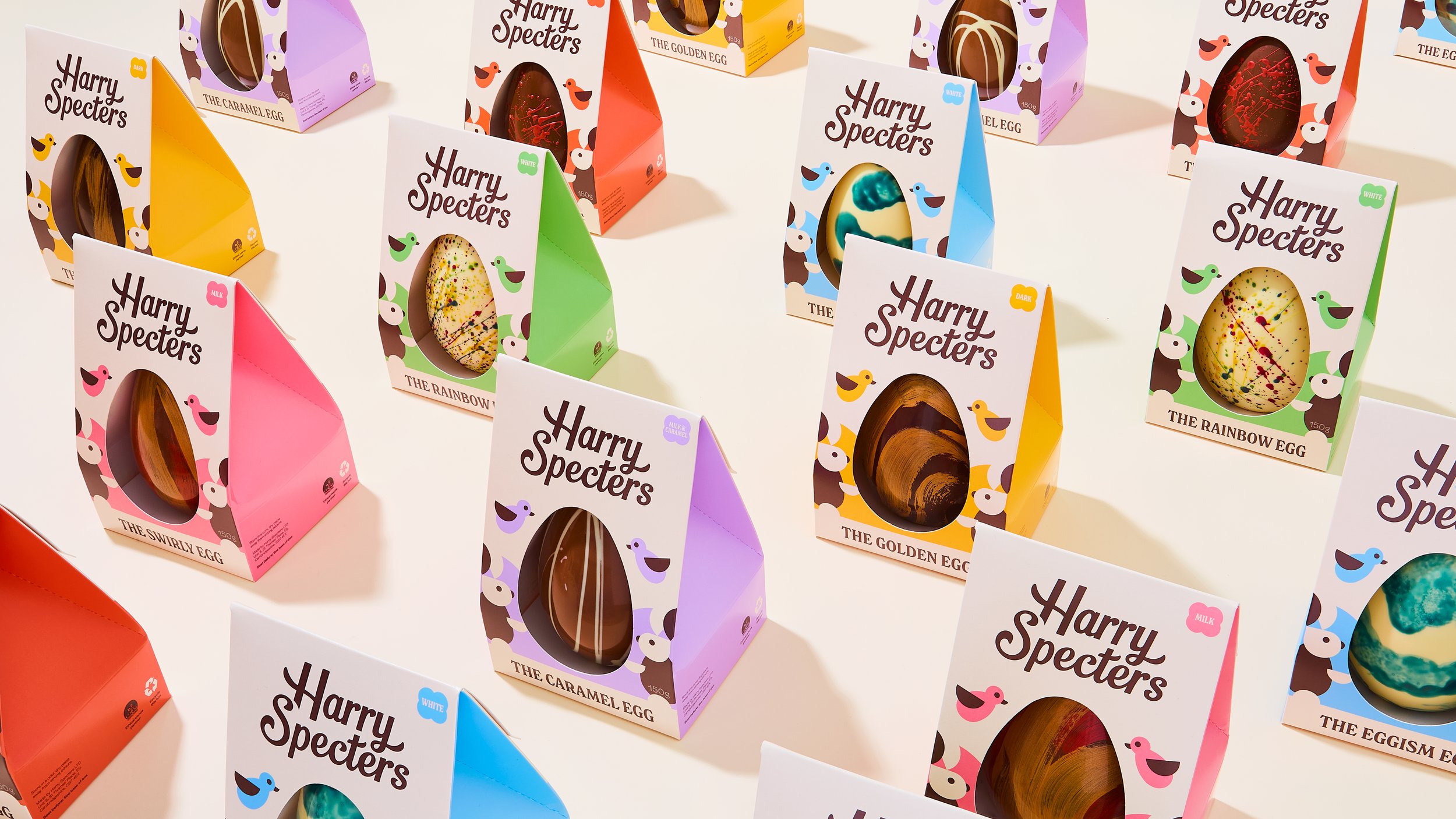
A vibrant range inspired by the idea of “A Joyful Spectrum.” Each egg was paired with a bright colour-blocked side panel, and a die-cut egg-shaped window to show-off the handcrafted chocolate egg inside. The design is clean and symmetrical, offering a sense of balance and calm — a nod to the visual harmony many neurodivergent individuals find grounding.
The result is a cheerful, cohesive collection that invites people to see and celebrate the world differently — through chocolate, through design, and through the joy of shared creativity.
Identity Design. Packaging Design. Artwork. Art Direction.
The Solution
Copywriting: Victoria-Anne Tessa
Photography: Amy Grover


